This follows on from my previous post which covered the process of yakisugi (scorching wood to raise the grain) which you can read here Now, on to the results!
I took a print from the pine block before the process. The grain was visible but I wanted it to be bolder, hence the yakisugi:
Before:
The finished block and print after yakisugi:
The cross section of wood I used at the same time was uneven to begin with. It had rough edges on its surface due to chainsaw marks. As I suspected, this meant that it refused to print evenly. However, the process did work and I was able to take some really nice impressions from areas across the block. Below is a comparison of the finished wood and one of the impressions I was able to take:
So, on to some experiments with composition!
I decided to add some other wood grain textures from prints I'd done previously and try some vertical compositions. Its amazing how flipping the format can make you think so differently!
Then I added some typography using some of the letters I'd carved earlier in summer (I posted about them here). The text is from a wonderful book called The Eyes of the Skin by Juhani Pallasmaa, a Finnish architect and philosopher. Pallasmaa's work has inspired a lot of my MA work (I'm going to post about this very soon)!
I'm really enjoying this technique. Its given me lots to think about going forward! What do you think?
As part of my MA and printmaking practice, I've been investigating different ways to enhance and raise grain in the wood I'm using for prints.
The first method I used involved brushing the surface of the wood with a wire brush. This works, although I've found that you often pick up incidental texture from the brush itself (small scratches etc). I think my brush was a bit too abrasive - I'm going to invest in a softer one!
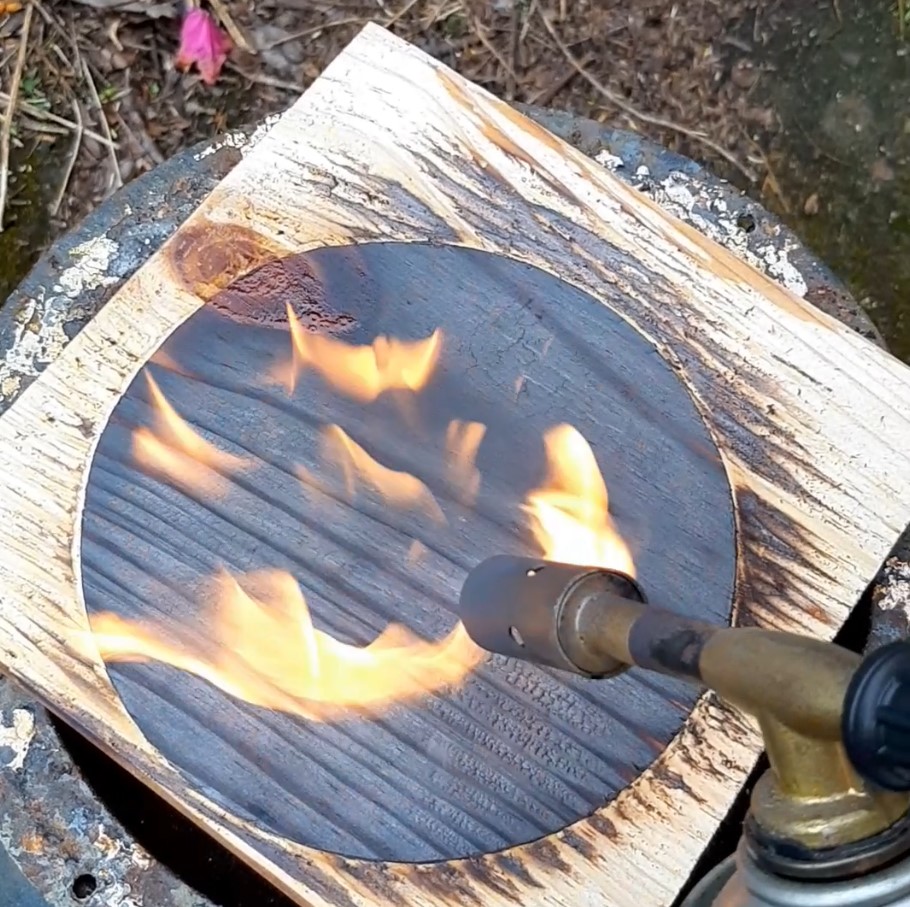
The next technique is called yakisugi (-ita) (焼杉板) , or sometimes shou sugi ban (both meaning 'burnt cedar') . It's a traditional Japanese method which involves charring/scorching wood in order to preserve and weather-proof the surface. It is not strictly a process designed for pintmaking; its used widely in architecture (wall cladding and interiors) in Japan. However, it also produces some very beautiful effects when used in relief prints.
The process and results are really quite special, not to mention the stunning pieces of wood you are left with once the process is complete.
The two pieces I started the process with were (left) a piece of pine (reclaimed shelving!) which I carved, and a cross section of wood I pinched from my dad's wood shed. I'm not at all sure if the cross section will burn or print evenly due to chainsaw marks and an uneven surface but experimentation is how you find these things out!
Both pieces were dried thoroughly before beginning the process since damp wood will not scorch effectively. Burning the surface is done using a blowtorch. Keep the flame moving over the surface to get an even result.
The surface will begin to char and will then crack slightly. At this point, you're done. I found that the knots (visible in the pine piece) were tricky due to sap rising to the surface and bubbling when I used the blowtorch (Pic below left). We'll see how it impacts the printing once I've finished the process...
Once the burning is done and the wood has cooled, it needs to be brushed along the grain to remove the burnt wood and reveal the grain for printing.
This is already quite a long post so I'll follow this up with another to show the results and how I've used them in some artwork so far.
Next up in the series of binding experiments is the blizzard book, developed by Hedi Kyle.
An origamatic binding, the blizzard book is created using a series of folds which in turn create 'pocket' pages resembling envelopes. Quite a fiddly process at first but becoming more intuitive with practice. The dimensions of the book can be adjusted to allow the envelopes to accommodate inserts of any size, making it a very versatile binding.
My attempt is detailed below. Rather than including dozens of photographs, I've tried something new, and made a video step by step to explain the folding process. I think is the easiest way to understand how its done;
I reckon this is a lovely little book. Its so adaptable. Next, I'm going to try making a blizzard spine to hold signatures - I have a feeling that might make a really nice non-adhesive binding.
Any comments or feedback on my step by step video are very welcome. Its my first attempt so I'm always looking for ways to improve!
When I started my MA, I had a clear idea that the final work would be presented in some type of structural binding, something which stood as a 3D object as well as a 'book'. I also wanted it to be non-adhesive. I'm not struck on using glues and chemicals in my work and I enjoy the elegance of stitched or folded paper structures. With this in mind I began a series of binding experiments, the first of which was a variation of an album binding.
For this version, I stitched the signatures to the peak of the mountain, rather than the valley. (I have seen this done both ways). This structure is really versatile; its perfect if you want your pages to lie flat when the book is open and its an excellent way to include lots of different types of papers and signature sizes in your final binding. My process is detailed below;
I began by calculating how many folds I needed for my spine based on how many signatures I wanted to include, plus covers. Each signature required a fold to be stitched onto. I had fifteen signatures, so I needed fifteen peaks. The spine was made from 130gsm grey construction paper.
Before stitching, I clamped each section in turn to avoid it slipping as I worked. The signatures are attached to the spine using a three station pamphlet stitch and waxed thread.
Below, you can see the signatures stitched to the peaks of the concertina spine as I mentioned earlier. I included different types of paper (cartridge, tracing and kraft) in this prototype, in differing sizes.
After stitching the signatures, I attached covers (textured Canson multimedia paper) to finish the book and give the binding stability.
The finished binding can be read as a book or displayed as a sculptural object in 360 degrees
I have to say, this is one of my favourite bindings so far. There are so many possibilities in terms of sie and paper types. I think its a strong contender for my MA outcome. I hope you like it!
Following on from my first attempt at carving my own letters, (you can read about that here) I decided to try again using Japanese katsura for the full set this time. Following a similar process as last time, I opted for a bolder, blockier typeface this time in order to show the surface texture of the wood to its best advantage. I also made sure to measure carefully while transferring the letters to ensure the finished blocks would all be uniform size. (Reminder - reverse your letters when transferring!)
Carving the katsura was a much smoother experience than the pine. I outlined all of the letters with my hangi-to knife this time which also made the process much neater.
Once the blocks were carved, they were divided and sanded. A much simpler process this time, proving that mantra 'measure twice cut once'! A razor saw was used for the finer detail. I did find that the katsura had much less tendency to splinter.
The finished blocks:
The printing...
I printed on tissue paper to see what a layered effect might look like and photographed the prints together, holding them up to the light.
I had the wonderful notion of printing this set on the hottest day of the year so far, so I had to work extra quickly as the ink was drying as I was rolling it out. Initially, I thought I was on a hiding to nowhere. As it turned out, the temperature and drying ink resulted in a lighter impression than I might otherwise have achieved and the resulting wood grain visible in the print is really pleasant. Next I think I'll try some scanning and enlarging to really emphasise the texture. Let me know if you have any thoughts on my experiments, or suggestions!