Friday, June 26, 2020

Lockdown Letterpress Experiment: Round 2...

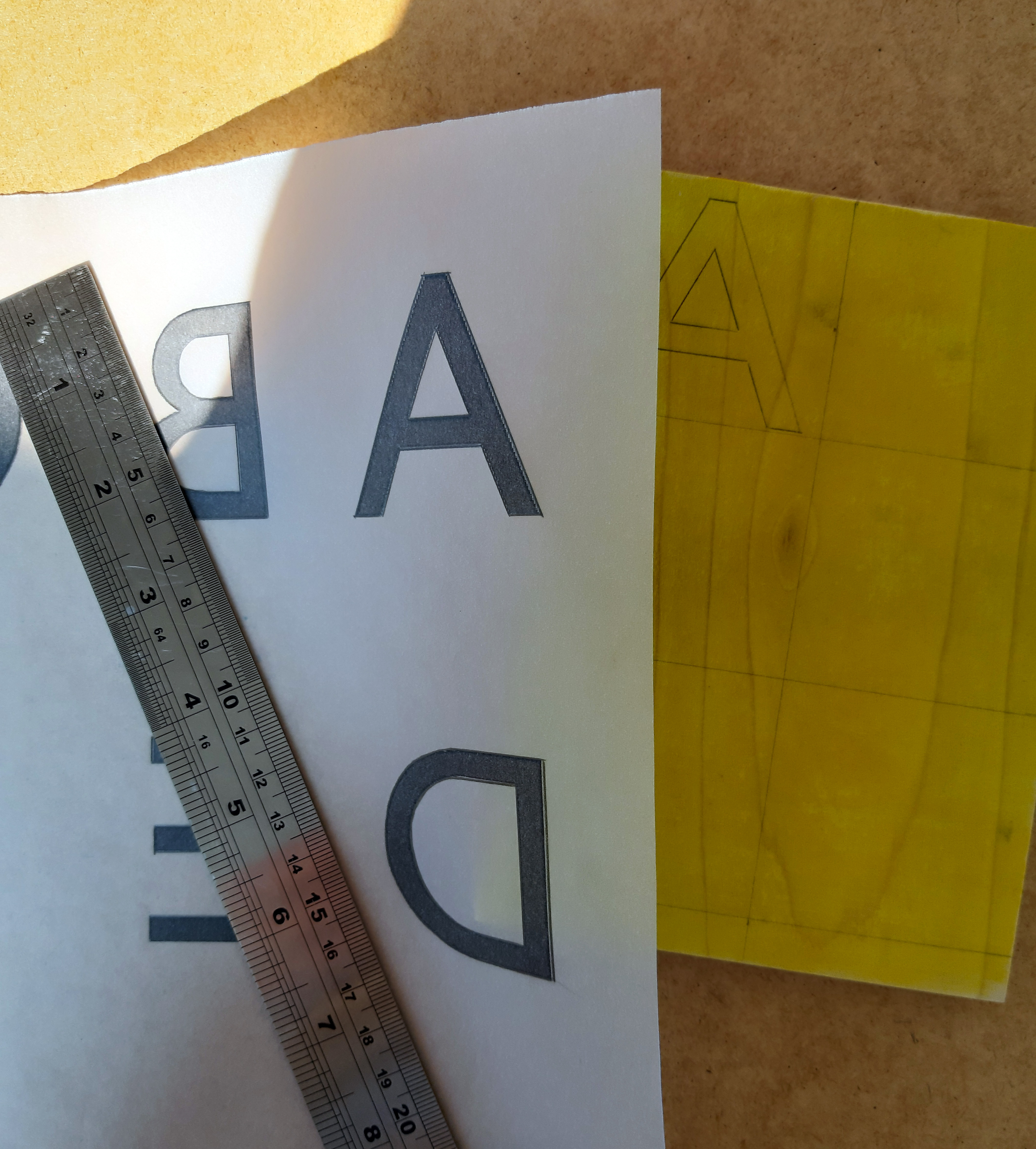
Following on from my first attempt at carving my own letters, (you can read about that here) I decided to try again using Japanese katsura for the full set this time. Following a similar process as last time, I opted for a bolder, blockier typeface this time in order to show the surface texture of the wood to its best advantage. I also made sure to measure carefully while transferring the letters to ensure the finished blocks would all be uniform size. (Reminder - reverse your letters when transferring!)


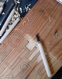
Carving the katsura was a much smoother experience than the pine. I outlined all of the letters with my hangi-to knife this time which also made the process much neater. 


Once the blocks were carved, they were divided and sanded. A much simpler process this time, proving that mantra 'measure twice cut once'! A razor saw was used for the finer detail. I did find that the katsura had much less tendency to splinter. 


The finished blocks:


The printing... 


I printed on tissue paper to see what a layered effect might look like and photographed the prints together, holding them up to the light.  

I had the wonderful notion of printing this set on the hottest day of the year so far, so I had to work extra quickly as the ink was drying as I was rolling it out. Initially, I thought I was on a hiding to nowhere. As it turned out, the temperature and drying ink resulted in a lighter impression than I might otherwise have achieved and the resulting wood grain visible in the print is really pleasant. Next I think I'll try some scanning and enlarging to really emphasise the texture. Let me know if you have any thoughts on my experiments, or suggestions!


Thursday, June 25, 2020

Necessity is the Mother of Invention


When lockdown began in March, along with many others, I found myself without access to a lot of the equipment and studio facilities I'd previously been lucky enough to enjoy. 

I'd begun to experiment with letterpress as part of my MA, using an eagle press and letterpress blocks in my university print studio, so when both suddenly became unavailable a solution needed to be found!

Once lockdown had commenced, I found myself in rural Northumberland with an abundance of two things at my disposal: wood and time. Add an enthusiastic and knowledgeable craftsman dad into the mix and I started to feel more optimistic. I was going to make my own blocks and hand burnish my prints. 

During April and May, I created my own letterpress blocks. I'm documenting the process below - I hope it might prove useful to others interested in the technique. 


I had a block of Japanese Katsura to hand, so I began by printing my letters (Gill sans) on tracing paper and transfered them to the block using graphite before carving. (Be sure to reverse your letters at this stage - or they print backwards!) I stained the block yellow to make seeing my carving process clearer. 


After lockdown, I had real trouble sourcing the katsura I had used for the first six blocks. So I transferred the remaining letters to an old pine plank. At the very least I hoped comparing the two types of wood would make for interesting results. I carved all of the letters and then divided the block after the carving was completed (below)


After dividing the block, I sanded each letter. The pine had a tendency to splinter, so real care had to be taken when using the saw. All in all, the above process took me around three days in total.

So, on to the results...


The completed blocks                                            Comparing the Katsura (B) with the pine (K)


And the full printed alphabet:


Findings: 

- Pine is softer than Katsura - this is visible in the above print, where you can see the letters A-F are cleaner than the following letterforms. 

- This softness made the carving process more challenging and ultimately, resulted in more visible imperfections in the final letters. 

- The blocks are all of unequal size - something I should have considered prior to carving. For my next attempt, I'm going to measure and place the letters more carefully to ensure the finished blocks are uniform in size and therefore easier to print. 

Ultimately, I was happy with this first attempt and I was eager to follow up on it by creating a second set, putting the above knowledge to good use. In the following post I will document the process of creating the second set of letters. 


Beginnings are always messy...

and this is a messy beginnng! 


Welcome to my blog. I'm a Northumbrian designer and printmaker and a current MA Design student. I'd like to share my experiments, thoughts and work on this blog for anyone who might be interested. Any insights and thoughts are very welcome. 

I specialise in wood based printmaking techniques, drawing and non-adhesive bookbinding. I'm especially interested in texture and tactility and I very much enjoy working with natural materials - allowing their innate characteristics to show through. I imagine this blog will be a jumble of all of the above along with a few ramblings. In any case, I hope it makes for reasonably interesting reading!


Yakisugi woodcut printmaking part 2

  This follows on from my previous post which covered the process of yakisugi (scorching wood to raise the grain) which you can read  here  ...